

With this new feature you will be able to create and manage a Mobile versione of your site that will be automatically displayed every time anyone tries to reach your website via a smartphone.
The mobile site has the same pages and the same contents of the original one, but it is displayed with a very simple and essential graphic model. The mobile version is optimized to be displayed on all the major smarphones, such as iPhone, BlackBarry, Android, Windows Mobile 7 e Nokia Symbian.
The final result of the mobile version may vary according to the smartphone you are using.
To activate the mobile option for your site you can purchase it while renewing your subscription to our services or you can purchase it through the mobile option that you can find in your control panel.
To modify your mobile graphic model, you have to access the site panel and then click on the site settings option. There you will find the mobile settings section.
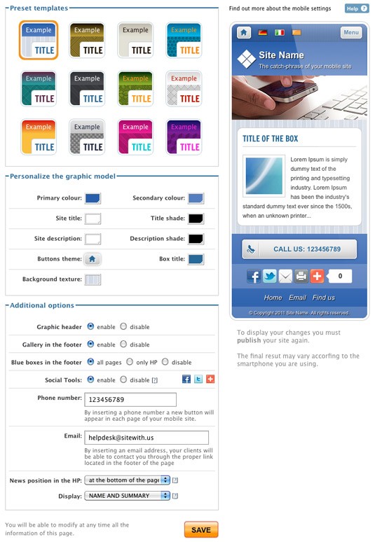
In this section you can display a preview of how your site will be displayed in its mobile version. To display any change you made to this version of the site, you have to click on the save button and then click on the yellow publish site button (the same one you use to publish any kind of content in your normal site).
In the mobile settings section, the first thing that you will find is a tool that allows you to customize the graphic model of your site: you can choose the one you like the most and preview it before publishing. You can customize the model further, by starting from one of the many that you find in the section.
You can change the colours of the background, of the title and of the description of the site and also the colours of the boxes’ title and any shadow. Furthermore you can select a texture for the background and change the theme of any button. To make those chages permanent and visible online, you will have to publish your changes after you saved them in the site panel. You will also be able to display a preview through the mobile settings section, before going online with the final result.
In the additional settings section you will also have the possibility to choose if you want to display or not the header’s image: by activating this option you will display the header’s site without animation.
With the footer gallery feature you will be able to activate and deactivate any album at the bottom of the home page or of any other page of the site.
Through the third option you can decide whether to diplay the blue boxes and the last feature allows you to manage all the viral tools, such as Facebook and Twitter.
By inserting your phone number in the proper field, a button will appear in every page of your site and if any of your visitors clicks on it, he or she will be able to contact you directly.
By inserting your e-mail in the proper field, your visitors will be able to write you an e-mail directly from their smartphone with their mail client.
The last features allows you to insert the news in the home page. The news are basically a preview of the contents of any advanced page for which you activated the contents in the homepage option. Furthermore, with the position menu you can decide whether to hide or not the news, or diplay them in certain areas of the page. For every content in the news section you can decide to display only the title or the title and a brief description.
For more details on how to activate the content in the homepage feature, visi tour section dedicated to the advanced page.
In the mobile version of your site, you can also find the standard option: this will allow you to switch from the mobile version of the site to the regular one and viceversa: in the classic version of the site you ill find the mobile button to display this other option.
If you wanna know how a mobile site is displayed on your smartphone, visit www.demomobile.it